This map of Gowanus highlights the Points of Agreement within the neighborhood, showing where they are located, what each organization does, and the specific areas they serve. It visually outlines the geographic coverage of these groups to help viewers understand how community support and environmental efforts are distributed across Gowanus. In addition to the Points of Agreement, the map also identifies other important neighborhood features—such as industrial zones, residential areas, and key environmental sites—to provide broader context. Overall, the map is designed to help someone quickly understand the social, environmental, and spatial dynamics of Gowanus and why these locations matter.
Non-Visual Spatial
There is a lot of information about POAs that might not show up on a map. Allowing for various inputs into the y-axis, one sees how each POA adjusts to different categorizations. For example, the graph below responds to POA funding, agency, beneficiaries and more. Utilizing the POA index numbers, there is a clear divide when it comes to a category like funding. Not only are a lot of them zero because there are no official amounts found, but there are also some that have very vague information when it comes to who and how each project is going to be completed. This graph pulls together information from these POAs to make it comprehensible to the public for whom the reforms are. By hovering over each symbol, a further explanation of each POA, including the status, which tells its progress is found.
Below is a circle packing diagram making funding more comprehensive. As seen in the visual, it is apparent that there are 3 major circles within the overall one. The smallest circle includes all the POAs with over $20M in funding, whereas the biggest one has all the POAs with zero funding. This diagram makes it easy to understand how many POAs truly are not in motion because they have little to no funding for completion. Mentioned before in the article, many POAs without funding are not going to happen, or do not have sufficient information to prove otherwise. Not only does this show funding, but it also allows for a better understanding of how agencies and POA statuses relate to received funding. Differing from the chart above, this visually sorts the POAs into agency and status within the bigger funding, depending on the bubble selected. It is very interesting to see which agencies have POAs with little to no funding compared to their status in the Gowanu community.
There is a lot to learn behind the scenes of creating POAs that are city funded. There are no consequences for not instituting these POAs. For example, who gets in trouble when some of these things don’t come into fruition? The City is trying its best to fullfill their promises to the Gowanus community, and this will track all that information for research purposes.
Rent Price Range
The diagram illustrates the locations of buildings from which rent data was collected. We analyzed rental prices for units located within the newly rezoned area and compared them to units located outside the rezoning boundary. This comparison was conducted to determine whether the rezoning is associated with differences in rent levels and to evaluate the magnitude of any observed price variation.
New Development Rent Analysis
Prices were fairly consistent between buildings inside the rezoning area and those outside of it. Studios and one-bedroom units showed similar ranges across both zones, while two-bedroom units included a few higher-priced examples within the rezoned district. Three-bedroom units were also comparable, aside from one outlier outside the rezoning area. Overall, this suggests that rental costs remain relatively uniform regardless of zoning location, indicating that factors other than rezoning are likely driving price differences. Additionally, it would be beneficial to look at how rent within Gowanus as a whole compares to other neighborhoods within the next 10-15 years, giving a better understanding on how the rezoning affects Gowanus overtime.

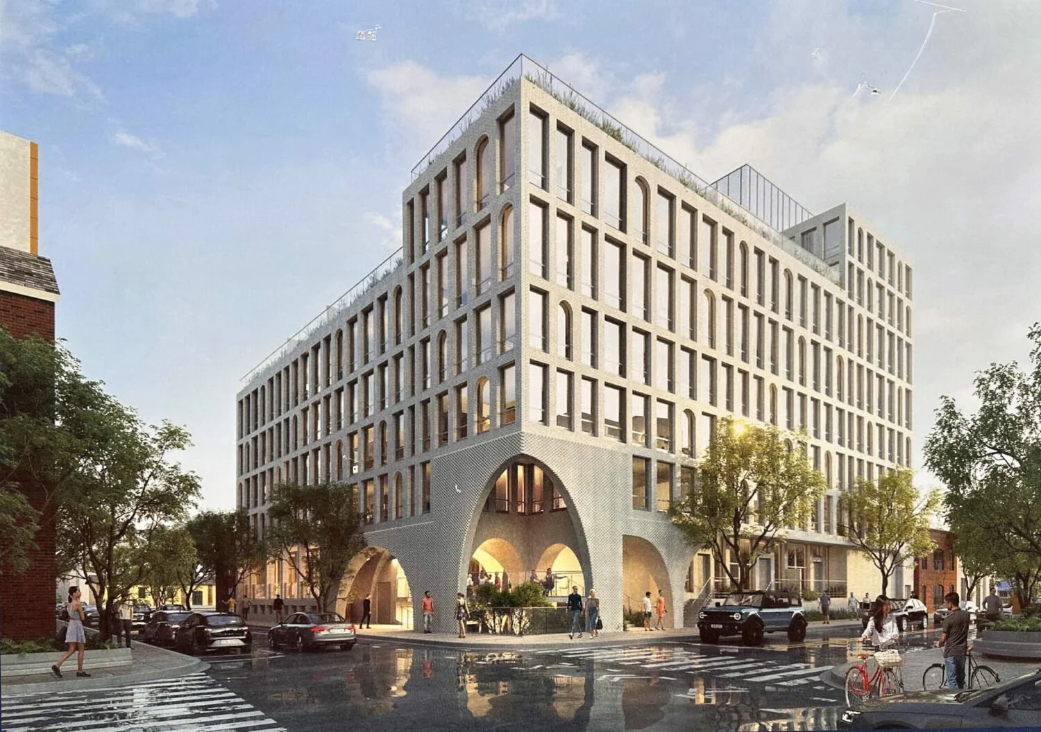
Nevins Landing
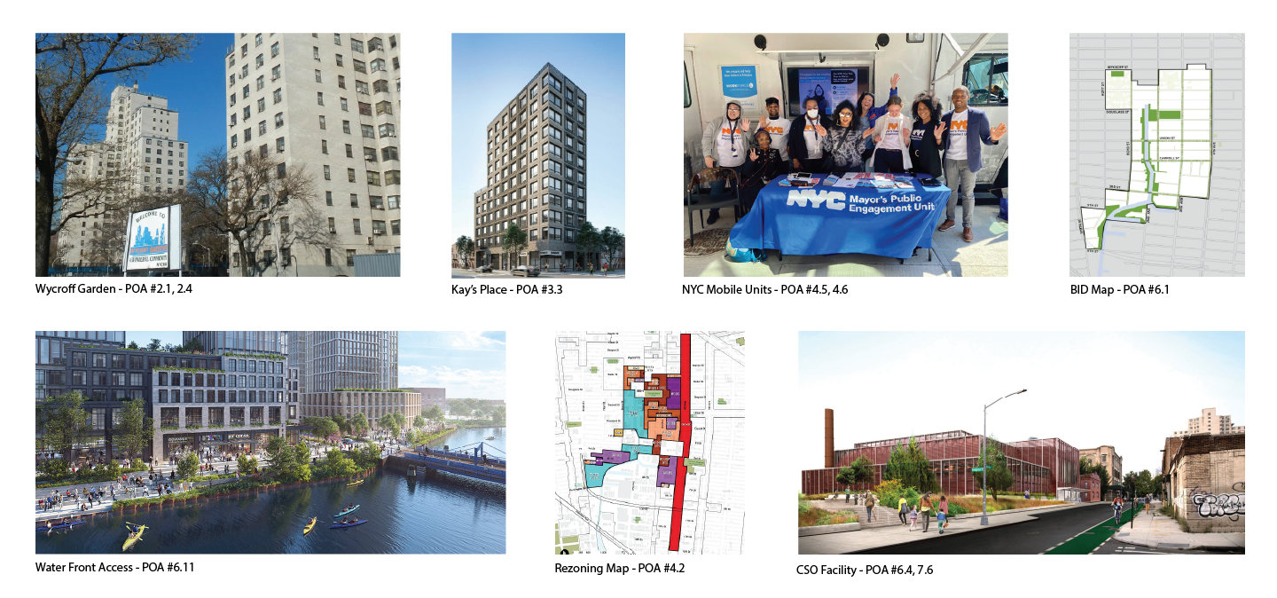
335 Bond Street
500 DeGraw Street
Precedent Comparative Analysis
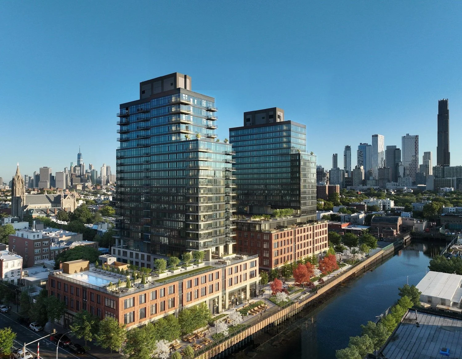
Hudson Yards
Hudson Yards is a 28-acre rezoning and redevelopment over Manhattan’s West Side rail yards and surrounding blocks, proposed in the early 2000s and approved in 2005 as a city-led public–private megaproject.
The plan transformed active rail infrastructure and underutilized industrial land into a high-density district of office towers, luxury housing, retail, cultural venues, and new public open space, anchored by the Hudson Yards platform and Hudson Boulevard and Public Square.

Gowanus
Gowanus is a roughly 82-block rezoning and neighborhood redevelopment centered around the Gowanus Canal in Brooklyn, proposed in 2018 and approved in 2021 as a city-led land use and environmental remediation initiative.
The plan converted former industrial and manufacturing zoning into mixed-use residential and commercial development while pairing new housing growth with major investments in sewer infrastructure, affordable housing, public space, and long-term canal cleanup and flood resilience.
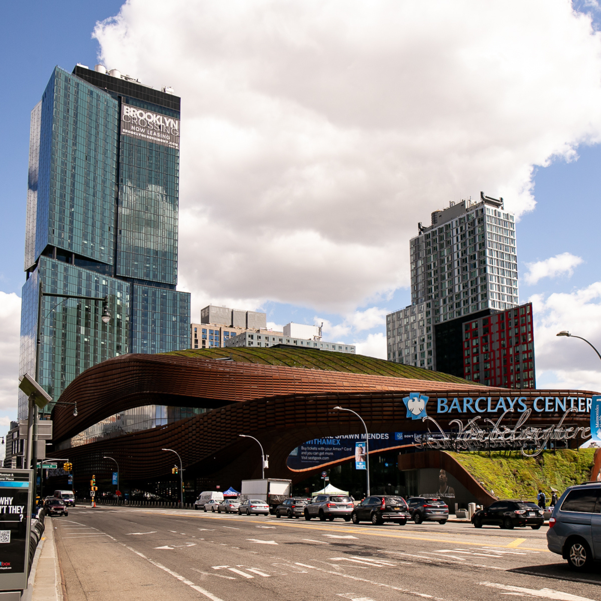
Atlantic Yards (Pacific Park)
Atlantic Yards (Pacific Park) is a 22-acre rezoning and redevelopment at Atlantic & Flatbush Avenues, proposed in 2003 and approved in 2006 as a state-led public–private megaproject
The plan replaced low-rise industrial and rail-adjacent land with high-density residential towers, a sports arena, and new open space, anchored by the Barclays Center.
This chart compares public investment priorities across Atlantic Yards, Gowanus, and Hudson Yards, showing that Hudson Yards received by far the largest funding overall, especially for major infrastructure and transit-related projects, while Gowanus focused heavily on environmental cleanup and sewer upgrades, and Atlantic Yards concentrated on construction, infrastructure, and site development. These investments are used to win over the public approval.
The graph reveals how different rezoning projects directed billions of dollars toward distinct goals — mega-infrastructure and real estate growth at Hudson Yards versus remediation and community investment in Gowanus — highlighting how planning strategies shape both urban form and public spending outcomes.
This chart shows that the Gowanus rezoning is driven by many mid-scale residential projects rather than a few extremely expensive towers. Unlike Hudson Yards, which is dominated by several multibillion dollar developments, Gowanus distributes investment across numerous buildings throughout the neighborhood. Most projects fall within a moderate cost range, reflecting a strategy focused on steady residential growth and neighborhood-scale transformation. This spread of funding supports the creation of thousands of housing units, infrastructure upgrades, and public space improvements rather than a single landmark development. Overall, the graph illustrates how cumulative investment across many sites is shaping Gowanus into one of Brooklyn’s primary areas for future housing expansion.
The unit comparison shows that the Gowanus rezoning is planned to deliver far more housing than comparable large-scale developments in New York City. With roughly 8,000 projected units, Gowanus significantly surpasses both Atlantic Yards and Hudson Yards in total residential output. This highlights the rezoning’s primary role as a housing-focused initiative rather than a commercial or luxury-driven development. The scale of unit production positions Gowanus as one of the city’s most important sites for addressing Brooklyn’s growing housing demand. Overall, the chart demonstrates how the rezoning concentrates on maximizing residential capacity through widespread neighborhood development.